Input Fields
Each item has some input fields as specified for its category. These input fields can be
| Field Name | Usage | Example Rendering |
| Rich Text Editor (richtext) | An editor allowing to enter formatted text. There are parameters to specify the height (number of lines visible) of the editor. parameter:
| |
| Plain Text Editor (text) | And editor allowing to enter plain text parameter:
| |
| File Manager (fileManager) | A control allowing to add file attachments to an item parameter:
| |
Tasks Control (tasksControl) | Allows to show links to external websites / issue tracking systems. Extensions for certain sites might provide additional functionality like back links. Currently these plugins exists:
For this field to work, you need to ensure that the extensions is globally enabled for the server (Extensions in the tree), and also for the project (Extension Settings for the project) | |
| Text Entry Line (textline) | Allows to enter one line of text parameter:
| |
| User Selection (user) | A drop down with all users in the project parameter:
| |
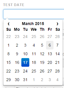
| Date Picker (date) | Control to select a date parameter:
| |
| Dropdown (dropdown) | Shows a drop down of pre/configured values. The values are configured as a setting of the project or hard coded as parameter. parameter & examples: see Dropdown Field | |
Downlinks (links) | Shows the existing downlinks and allows to create new links as well as new linked items disabling the "Hide Create Buttons" settings: parameter:
| |
Uplink Information (uplinkinfo) | This control does not show up in reports and documents. Allows to show information about uplinks. Different options are available: parameter:
Example configuration to show uplinks with unlink button { "exists": true, "cats": "REQ", "itemInfo": "reflistedit" }Example configuration to mark uplinks to risks as risk controls { "exists": false, "cats": "REQ", "icon": "fa fa-exclamation-triangle", "iconfg": "yellow", "iconbg": "black", "text": "uplink info to REQ missing" } | |
| Cross Project Links (crosslinks) | Links to items in other projects parameter:
| |
| Table control (steplist) | A table with by default two columns: action and expected result. Table columns can be customized as a setting of the field. parameter & examples: see Table Configuration | |
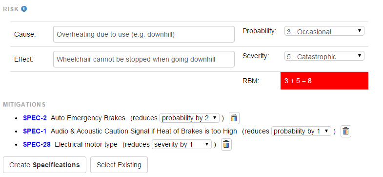
| Risk Control (risk2) | The risk formulas can be configured in a project setting or if it is necessary to have two or more different risk configuration in one project, the setting can also be saved with the field. See Risk Management for the options. | |
| Checkbox (checkbox) | A checkbox control If an item category has a checkbox, this checkbox can be configured to only show in items if it is checked. parameter:
| |
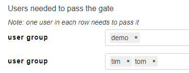
Quality Gates (gateControl) | Gate fields allow you to lock or unlock other fields in forms. A gate is activated by approval of one or more users. These are the options to specify users to lock: A gate is approved if one user in each group has clicked on "Pass". If a gate is approved the following can be be done:
It is also possible to add a review comment when passing or failing a gate. Printing: It is possible to specify the text which is added to documentes depending on the status of the gate. If no text is specified, nothing is printed. Searching: it is possible to do a full text search to find items e.g.
This can be combined with mrql to seach in specific fields, e.g. mrql:"Gate 1"~"_failed_" parameter:
| |
Design Review Table (reviewControl) | Review controls allow to perform design reviews of other items in the tree. See Configuration Review Controls for details on how to configure it | |
| One2One Issue Mapping (workflow) | This field is actually shown in the toolbar: it allows to create a tight relation between a Matrix item and a task in an external system (JIRA, ...). You need to add these in the Extension Settings for the project (i.e. under Advanced of the Jira Cloud Plugin), for this field to work:
"color":"grey", "background":"transparent" } |
Common parameters for fields
When some fields (Rich and Plain text + (user) Dropdown fields) are marked as "Require content", the item can't be saved without content in that specific field:
Common parameters for fields
- read only control: If checked, the control will not be editable by the user
- do not print in reports: if checked, the field will not be shown in reports
- do not print in reports: if checked, the field will not be shown in documents
Note for the FOLDER category the same thing can be achieved by a project setting hideFields, which can have two settings, hideDoc and hideReport. Both can contain a list of field id's which should be hidden, e.g.
{ "hideDoc" : [1683, 1688] }
- help to show under section name: shows a text in the UI to explain the user how to fill the field
The above is the default method, setting the property inlineHelp. There are 3 methods to show some help for a category. All can be changed int he advanced settings:- externalHelp: this can be set to point to a an external website which is openend when user clicks on a link, e.g. "externalHelp":"matrix.com". Note: this must be a website which is accesible through https://url
- popupHelp: this can be set to show help as a tooltip, e.g. "popupHelp":"enter a short description"
- inlineHelp: this can be set to render a help line underneath the "heading":"enter a long description"
Special parameter for SIGN category
- when creating the SIGN, copy the value of the field with the same name from DOC: This allows to copy fields from underlying DOC into the SIGN item.
Note: Fields are copied only if this is set to true and the labels (names) of the field is the same in the DOC and the SIGN - Advanced options:
- invisible: if set to true, the field is not visible (only makes sense with the above flag)
Special parameter for FOLDER category
It is possible to add fields to the category FOLDER. If these fields should only be visible for the folders in a specific category, they need the parameter visibleOption set to the category name, e.g.
{"visibleOption":"XTC"}


